Bernadette (Wnek) Neal
Overview: Designing Computer-Based Training
EDUC 767 is the third of four courses in the Graduate Certificate Program
in Instructional Design. Topics covered include:
Introduction to CBT
Planning for CBT
Instructional Strategies for CBT
ADA and Universal Design
Reusability (SCORM)
Storyboarding
Prototypes
Usability Tests

Design Document
This activity required creating a Design Document and Flowchart for one lesson in the overall course project described on the Project Summary page. The lesson has been developed as a Reusable Learning Object.
Click the PDF icon below to view the document.

Storyboard
Below is the Storyboard for the RLO described in the Design Document.
Click the PDF icon below to view the document.
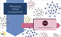
RLO & Usability Test
Below is the RLO for the lesson described in the Design Document, developed using Captivate 2017, and the corresponding Usability Test.
Click the thumbnail below to view the lesson.
Note: This project was published as SCORM-compliant. When launching the course, you will see a pop-up message stating that an error has occurred due to the LMS API not being found. This is expected behavior when viewing the course outside of an LMS environment. Click OK to proceed. The lesson will open in a new browser tab. You will also see a small, blank pop-up window. This window can be closed, as it is not needed and is a result of the SCORM packaging.
Click the PDF icon below to view the document.
Reflection
Instructional Strategies and Decisions
For the lesson I chose to develop as a standalone CBT, I turned to the alignment chart I created in the previous class for a list of strategies. I kept all strategies, but one. I wanted to ensure that I had at least one instructional strategy that falls into each of Horton’s categories of Absorb, Do, and Connect Activities for the most effective learning. I have two Absorb activities/strategies for presenting information to the learner. The first is an interactive presentation on the list of causes of why a user might leave a community and the other is an example in the form of a conversation between a community manager and a supervisor that could actually take place in the real world. The Do activity/strategy is a choice between two knowledge checks that is scenario-based to give learners an opportunity to practice on their own. The Connect activity/strategy is a simple evaluation activity using a Likert scales so learners can reflect on how the information presented connects to their own situations. I felt I needed to remove the journal activity as that strategy was not viable in a standalone CBT because it really needs to be graded by an instructor against some kind of rubric.
One of the most important decisions I made regarding instructional strategies was using a scenario-based learning activity. Pappas (2014) wrote, “Information offered within a contextual setting enables learners not only to easily manage it within their working memory, but also to commit it to their long-term memory" and this is where real learning happens. Being able to recall possible causes as to why users leave a community is a low-level skill on Bloom’s Taxonomy, which is fine, but I wanted learners to use that information in a more useful way, i.e., be able to identify at least one of these causes in a real-world scenario and, ultimately, in their own situation. That is the overall goal of the lesson, not just recall. Scenario-based learning also engages learners because they can see how it can be applied in real life and help them solve a problem they are currently experiencing. To increase engagement in the scenario-based learning activities (the example and knowledge check mini-case studies), I presented some content as conversations and questions because Pappas (2014) offered the suggestion of “including dialogue that can draw in the learner and make the experience more realistic and immersive.” Adult learners are problem-centered, so I wanted to give them a chance to solve a problem.
Visual Design and Decisions
I referred to Horton’s E-Learning by Design, online chapter 14 about Visual Design for many of my design decisions. Some of the first and basic decisions were about the colors and fonts. Because Horton (2012) said to “make the text an adequate size, typically at least 10 points” (p.23), I decided to make the smallest font size 14 and used a maximum of 3 font types. “Most experts opt for the dark text on a light background” (p.25), so I used black font on a light blue background. I wanted to include Click and Reveal interactions with audio narration, not only to engage the learner, but because of the amount of content I needed to present. Horton (2012) says, “Often you will want to include more information than will fit comfortably in e-learning displays. The solution is to first edit the text, and then move some of the remaining information to the narration track. Finally, display just key phrases that are synched to the narration” (p.33). I followed this advice not only for the Click and Reveal interactions, but it is also why I created “conversations” in the example and mini-case studies presented. Visual consistency was also an important consideration so the learner could have some basic expectations for how content would flow and where to find basic navigation buttons. For example, the way I formatted the scenario-based Absorb activity carries through to the Do Activity/Knowledge Check, which is also scenario-based. I also felt I needed to create a balance between the principles of multimedia and coherence. While words and graphics together foster better learning than one of those elements alone, I didn’t want to add graphics just to have it and possibly distract the learners from absorbing the content.
Accessibility and Decisions
The information in the lesson needed to be presented both as audio narration and as text in order to be accessible. Closed Captioning was my first choice for a text alternative to the narration, but I needed to change that strategy due to some odd technical difficulties and time constraints. So, I included PDF transcripts of the audio narration that learners can choose to display. While some audio narration played automatically, in some sections, I gave learners a choice between hearing audio narration and reading a transcript. I also included accessibility text for screen readers on images and buttons throughout the lesson. Another consideration was how button rollovers would display so that learners knew it was a clickable object. I wanted to include two visual cues, one being a change of button color and the other being something other than color such as removing the outside shading of a button. Finally, I checked https://webaim.org/resources/contrastchecker/ to ensure that the contrast in colors was acceptable according to accessibility standards.
Assessments and Decisions
The assessments needed to be easily executed via CBT and allow for immediate feedback. A scenario-based knowledge check is a great formative assessment activity that was easily implemented in the form of a multiple-choice question. An evaluation activity using a Likert scale was also easy to implement, not only as a Connect activity, but as a useful tool in gathering more information on what learners might need to learn more about. I wanted learners to have several opportunities to get the right answer, but no so many that they would lose interest or get frustrated. So, after 3 failed attempts, learners are sent to the “answer page” with an explanation and then to the final activity. After each of the first two failed attempts, I wanted to include specific feedback with hints that would guide the learner in selecting the correct answer and reinforce what the learner (hopefully) learned in the lesson.
Results of Usability Test and Changes Made
There were two comments from a tester on my usability test were a bit surprising because they actually went against what I had learned to be best practices in instructional design. One comment said the tester preferred to read long sections of text rather than hearing a narration. I thought this was went again the Principle of Modality, which says it’s better to present words as audio narration rather than on-screen text. The other comment made was that the tester preferred to see ALL the text in the conversation chat bubbles rather than short phrases while hearing the audio narration, which I thought went again the Principle of Redundancy that says presenting words in both text an audio narration can hurt learning. I was hesitant to make major changes based on these two pieces of feedback. I would rather perform additional testing on a few more learners. I still feel that my original decision to provide both audio narration and a PDF transcript addresses these two comments.
New insights into competencies for instructional designers
Creating this CBT made me see the importance of not only finding images that are appropriate visually, but knowing how to use them according to copyright licenses. If there is no graphic designer to provide graphics, then the graphics responsibility falls on an Instructional Designer. IDs really need to have a good bank of graphics or resources to find them in these situations, which can very time-consuming. It was a challenge finding graphics that had a similar look and feel and I didn’t want the graphics in my lesson to look like a hodge-podge of unrelated graphics. Understanding what different licenses allow, what kind of attributions need to be made, and if modifications are allowed are important skills to have as an ID to avoid stealing someone’s work and creating the possibility of a lawsuit.
There is also a lot of tech savviness needed on the part of an Instructional Designer. IDs need to not only know a variety of content authoring software, but other software products that might be needed to complete a CBT such as graphics and audio editing software like Photoshop, Snag-It, Audacity, to name only a few. They need to be aware of how learning content might appear differently in different browsers and versions of browsers or LMSs. IDs need to be great troubleshooters when technical issues arise and find quick resolutions for them.
Professional Growth and Reflection on CBT Design
The most valuable concepts gained during this course were Clark and Mayer’s six fundamental principles of well-designed computer-based instruction, which include the principles of Multimedia, Contiguity, Modality, Redundancy, Coherence, and Personalization. Some visual design principles were already obvious to me based on my own experience as someone who’s taken web-based training, such as ensuring the font contrasts sharply with the background, that the font size is not too small, or avoiding the “Picasso Effect” of using way too many colors and fonts for emphasis. The Clark and Mayer’s list of six principles is a concise job aid that I can use to refer to in order to avoid some of the more common mistakes made in e-Learning. I’ve learned it can be a fine line when presenting text, graphics, and narration in a way that maximizes learning vs. distracting the learner.
The most valuable and fun activity completed during this course would be a tie between storyboarding and creating the actual RLO. This is where I started to see an actual product being made after a long planning process. In the end, it’s that product, the e-Learning that needs to be delivered and, for me, it feels like it starts to take off at this stage. Getting some hands-on practice and creating a deliverable that I can display as a final product is valuable in showing off my ID skills.
This course will impact my instructional design in three major ways: 1) appreciating and developing the skills required to plan an RLO before actually creating it, 2) considering and incorporating more ways to make the learning I create as accessible as possible, and 3) expanding my knowledge and skills of a popular content authoring software (Adobe Captivate) in a practical way. I never realized how much planning was involved in creating an e-Learning product, but I can understand why given the time it would cost to edit a CBT without a lot of forethought. Because I’m eager to show a tangible product as a result of my time, I probably tend to estimate the amount of planning time to be less than it actual should be. Going through this course/exercise gives me better experience at estimating the planning stage. A part of the plan will include more consideration for Universal Design, which is more than 508 compliance. Every learner should have the same opportunity to get the most out of the time they spend learning. Finally, this course has given me practical experience that I can use on other projects. It gave me the chance to try out different techniques and see what works and doesn’t work and what can really enhance learning and what might just be for show.
My biggest concern about designing and developing computer-based training would probably be the need to learn quite an extensive variety of software products and keeping up with new feature roll-outs for all of them. As I mentioned earlier, it’s not just content development software, like Captivate, Storyline, Camtasia, etc., but other “companion” technologies like graphics and audio editing software, changes to browsers, such as knowing Flash is being deprecated and plugins are being removed, and updates to SCORM. To answer this concern, I will refer to the online community forums hosted by each software product’s company. I’ve also found communities of Instructional Designers, such as ATD and The ELearning Guild to be invaluable, as well as individuals in the industry like Christopher Pappas, Cathy Moore, Paul Wilson, and Tom Kuhlmann just to name a few, who post articles and tutorials on common techniques, questions, and new features.
References:
Horton, William. E-Learning by Design (Second Edition). (2012). San Francisco: Pfeiffer.
Clark, R., & Mayer, R. (2003). E-learning and the science of instruction. San Francisco: Pfeiffer.
Pappas, C. (February 14, 2014). The Basics of Scenario-Based e-Learning. Retrieved from https://elearningindustry.com/the-basics-of-scenario-based-e-learning